Build Responsive UIs in Flutter
by Raouf Rahiche
src https://medium.com/flutter-community/build-responsive-uis-in-flutter-fd450bd59158
相關文章
- Layout 1: Layouts in Flutter
- Layout 2: Tutorial
- Layout 3: Creating responsive apps
- Layout 4: Dealing with box constraints
設計師喜歡使用 響應式 (responsive) UI,但要在現實生活中實做它們並不是那麼容易。作為 Flutter 開發人員,您不應對設計師說 NO。所以 let’s make them happy again.
TDLR :
- 在響應式 UI 中,我們不對尺寸和位置使用寫死的值。
- 使用 MediaQuery 來取得視窗的即時 (real-time) 尺寸。
- 使用 “Flexible” 和 “Expanded” widget 來取得一個 flexible UI,該UI可以使用百分比而不是寫死的值。
- 使用 LayoutBuilder 取得 parent widget 的 ConstraintBox。
- 您可以使用 MediaQuery 或 OrientationBuilder 獲取裝置的方向 (orientation)。
What are the components of responsive design?
在響應式設計 apps 中,我們需要考慮三大方面:尺寸,方向和裝置類型,只要其中任何一個改變,apps UI 就會改變。
例如,如果您在縱向模式下的一列中有一張圖像列表,則在橫向模式下應該變成兩列,以便在一頁中 “向用戶顯示盡可能多的內容”,在這個小例子中,UI 取決於裝置的方向。在下一部分中,我們將通過一些例子討論每個組件。
What’s the problem?
這裡的主要問題是 UI widgets 的尺寸和位置的 hard-coded values。因此,要解決問題就是不要使用它們,對嗎?是的,但這只是解決問題的一部分,因為在響應式 UI 中,您不僅會縮放 Widgets,有時會改變它們的位置,而有時會根據可用空間進行改變。在本文中,我將為您提供一些有關此操作的提示。
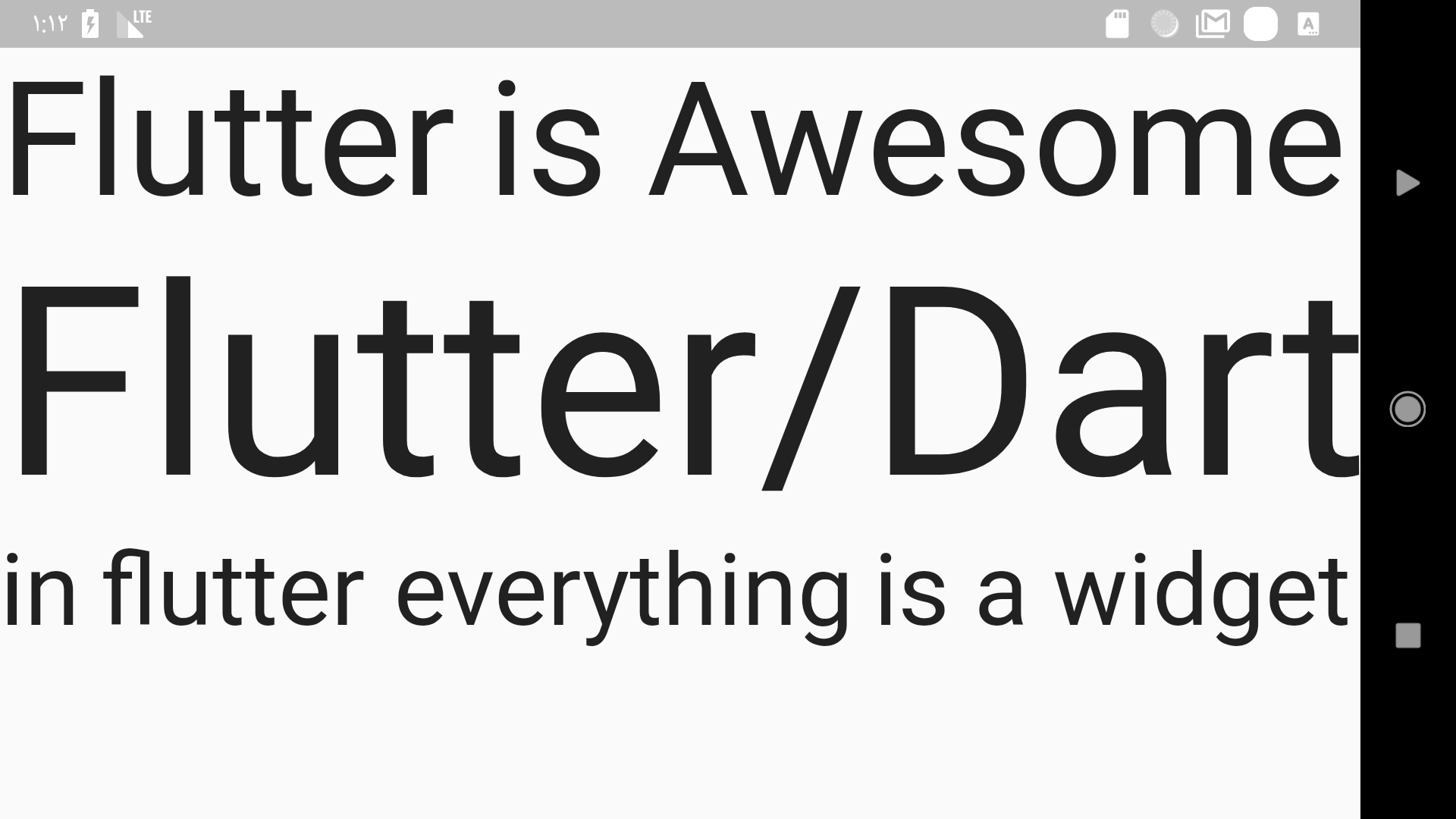
INFO: The unit of measurement in flutter is logical pixels.
1. Different screen sizes
Flutter 同時支持 android 和 IOS 裝置,並且它們都具有多種尺寸,不可能為每個裝置都進行佈局,但是可以並且非常容易地使一個佈局比例適合所有裝置,在 Flutter 中,有一套在這種情況下有幫助的 Widgets。讓我們來談談其中的一些:
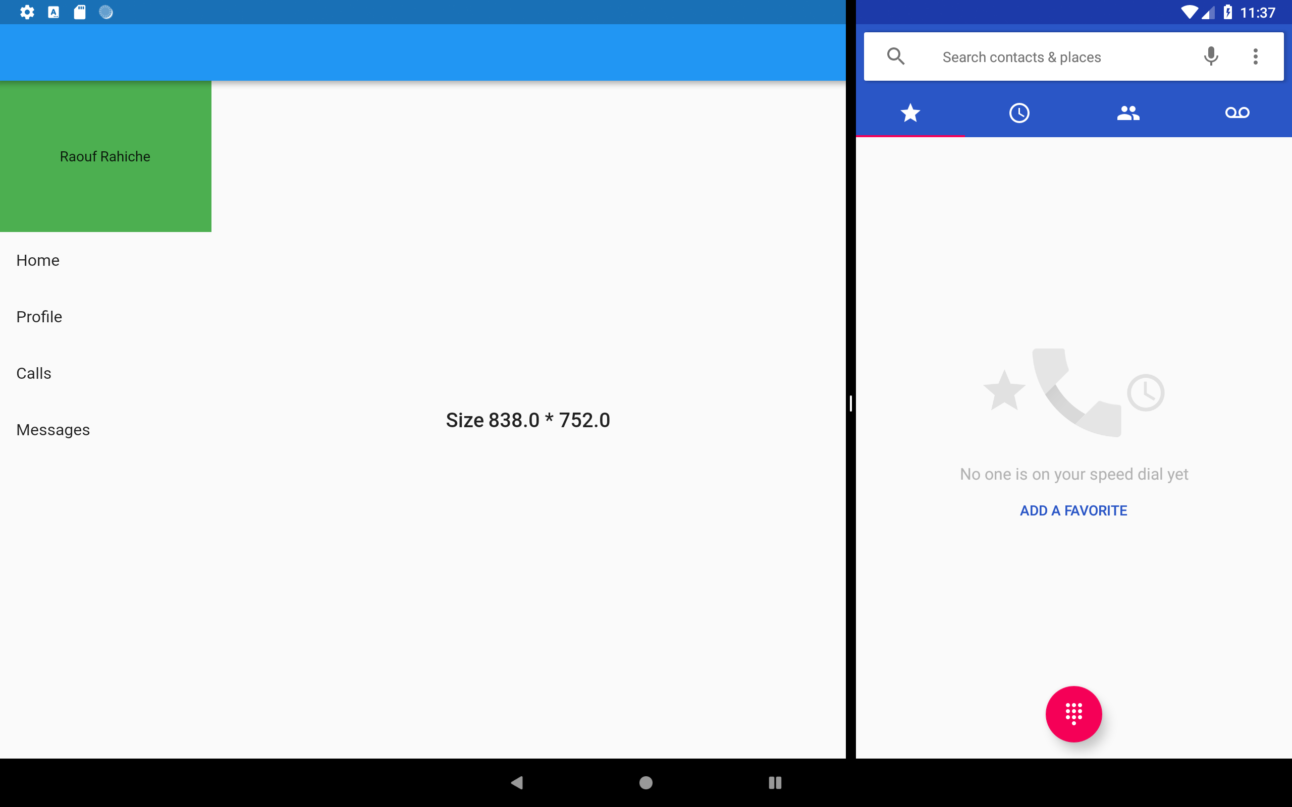
MediaQuery 是一個 InhertedWidget ,它為您提供有關當前媒體的信息(也就是您的應用程式所在的視窗),例如裝置的大小,方向和像素比率。
因此,例如,如果您有一個抽屜式選單 (drawer menu),並且只想在媒體寬度小於 600 才顯示它。如果媒體寬度大於 600 時,則您將在左側顯示一個普通選單。
NOTE : 600 is just an example for an android tablet screen but if you want to know more about the right numbers you should read this for android and this for IOS
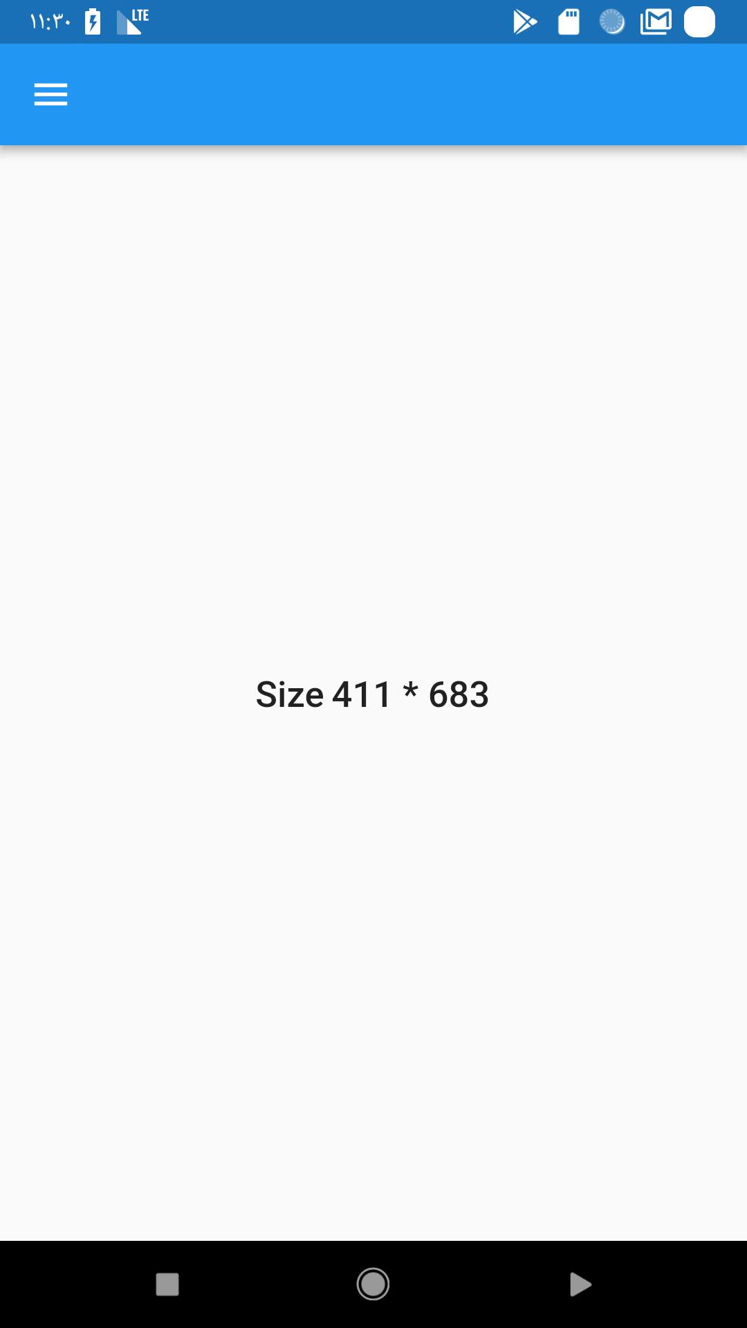
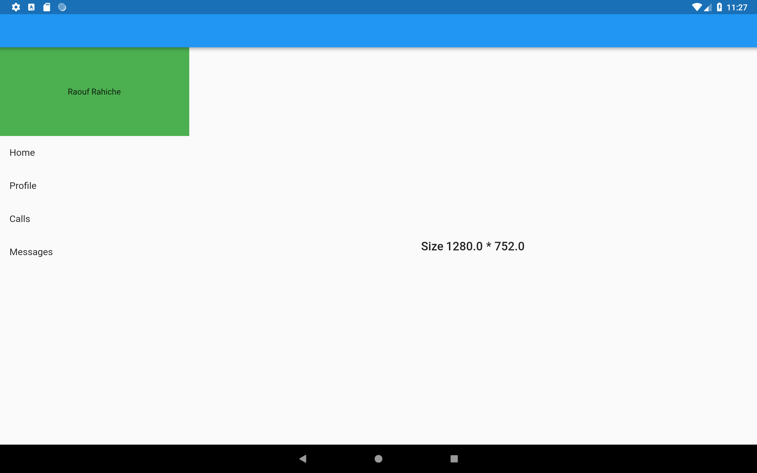
Widget build(BuildContext context) {
media = MediaQuery.of(context).size;
Scaffold(
appBar: AppBar(),
drawer: (media.width < 600)
? Drawer(
child: Menu(),
)
:
,
body: Row(
children: <Widget>[
(media.width > 600)
? Flexible(flex: 1, child: Menu())
: Container(),
Flexible(
flex: 3,
child: Center(
child: Text(
"Size ${media.width} * ${media.height}",
style: Theme.of(context).textTheme.title,
)),
),
],
),
);
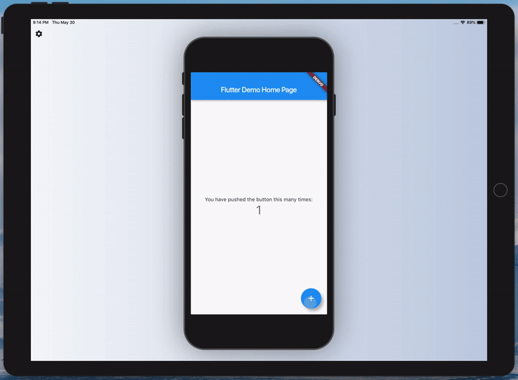
}這個例子非常簡單,我們有一個 Scaffold,它包含一個帶有兩個子行的 Row,中間是一個 Text,左邊是一個 menu,僅當條件為 true 時才會顯示。the interesting the third line where I declared media
現在,如果您在平板電腦和中型 Android 設備上運行此應用程式,您將獲得不同的 UI:
TIP: 使用 breakpoin package 可取得有關螢幕的有用資訊,並將螢幕佈局分為可依據視窗大小輕鬆 隱藏/顯示 的 columns。
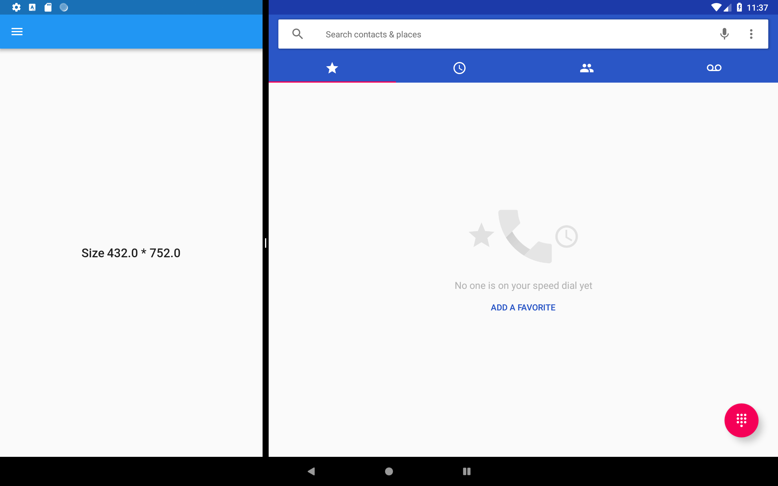
目前,Android 和 IOS 都具有即時 (real-time) 視窗改變的功能,例如,我們擁有 Multi-Window Support,在這種模式下,用戶可以修改 app 的大小,並使用 MediaQuery 仍然可以獲取確切的大小。讓我們在多視窗模式下運行前一個 app,您會看到它如預期地執行地執行。
在前面的例子中,我們不僅使用 MediaQuery 來獲得這種靈活的設計,還使用了其他 widgets,例如遵循 FlexBox 佈局系統的 Flexible,讓我們再多談一點。
Flexible 和 Expanded 是兩個 widgets,您可以在 Row,Column 或 Flex 內部使用它們,以使其下層 children 可以靈活地擴展以填充可用空間。在下面這個例子中可以顯示它們之間的主要區別:
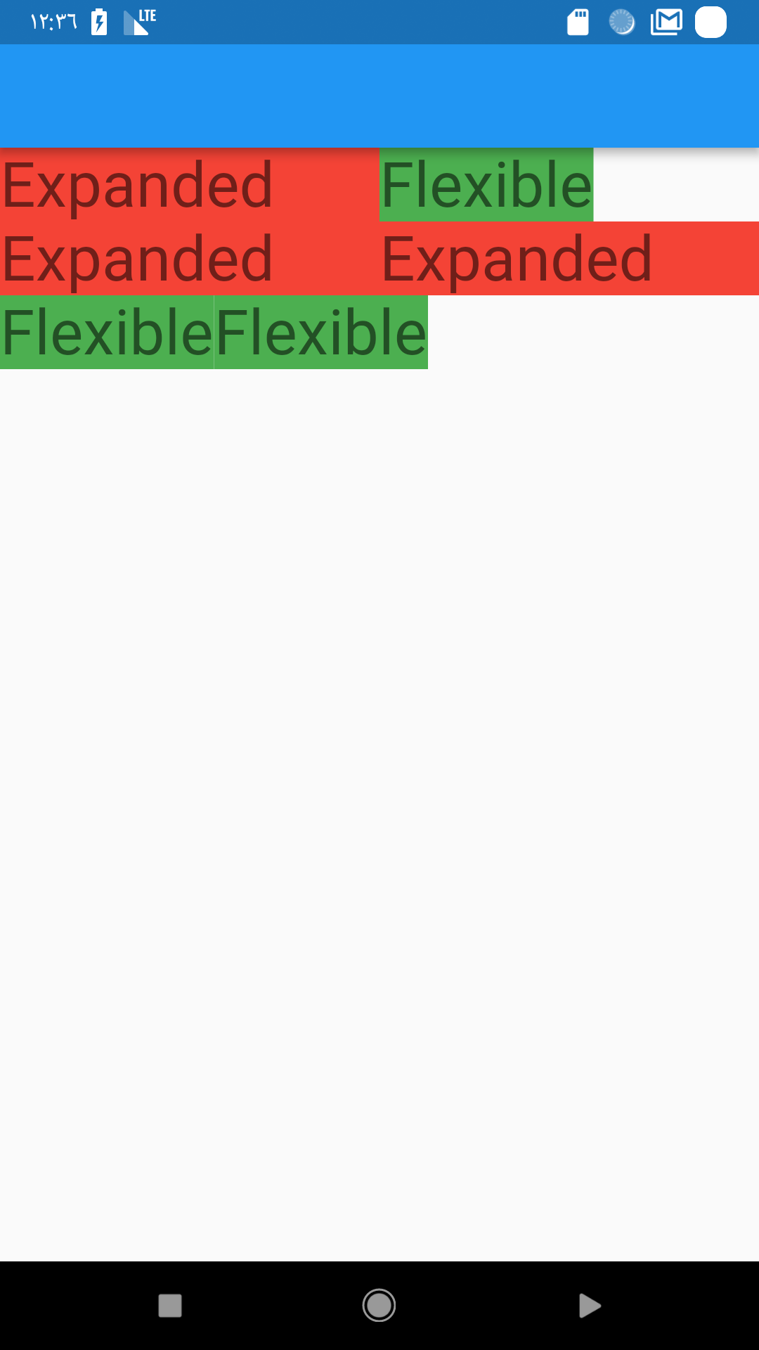
Scaffold(
    appBar: AppBar(),
    body: Column(
        children: <Widget>[
          Row(
            children: <Widget>[
              buildExpanded(),
              buildFlexible(),
            ],
          ), // Row
          Row(
            children: <Widget>[
              buildExpanded(),
              buildExpanded(),
            ],
          ), // Row
          Row(
            children: <Widget>[
              buildFlexible(),
              buildFlexible(),
            ],
          ), // Row
        ],
    ), // Column
); // Scaffold
buildFlexible and buildExpanded are just two functions they return the right widget.
For example :
Widget buildFlexible() {

    Flexible(
        child: Container(
          color: Colors.green,
          child: Text(
            "Flexible",
            style: Theme.of(context).textTheme.display1,
          ),
        ),
    );
}
NOTE: If you don’t provide a flex value the default value is 1
So the difference is that the Expanded widget requires the child to fill the available space while Flexible does not. and now you can use them to distribute space between multiple items
MediaQuery 將為您提供可用於您的應用程式的 global size,同時您可以將 LayoutBuilder 視為 local MediaQuery ,但更多地聚焦在 size constraints,因此它將為您提供 parent widget 的 constraints 以讀取它們並根據它們決定要顯示什麼。
NOTE: 在 Flutter,所有一切都是 widget 即使是 app 也都是 widget,因此您可以通過使用 LayoutBuilder 來實現我們在第一個例子中所做的相同操作,只需將 Scaffold 包裹在 LayoutBuilder 中並在條件中使用 maxWidth 值即可。
如果您希望固定大小的 widget 自行縮放和放置 (position) 以適應可用空間,則必須使用此 widget。在這個例子中,我有三個 Text widgets,在 FittedBox 的幫助下,它們將自行縮放以達到始終在兩個方向上都適合屏幕寬度。
PRO TIP: 使用 flutter_device_preview package 以不同的實際屏幕尺寸和不同的方向測試您的應用。
2. The Orientation
The orientation change is another type if run time size change just like what we saw in the multi-window example above but in this time it’s more specific for phone users because most of the time people change from portrait to landscape mode to get more data in the viewport.
- access the device orientation
using MediaQuery:
using OrientationBuilder :
NOTE: both of the ways use the same logic which is if the width > height then it’s portrait otherwise it’s landscape but the OrientationBuilder uses the parent BoxConstraints so unless you provide an explicit maxWidth that’s greater then the maxHeight you will get the right orientation .
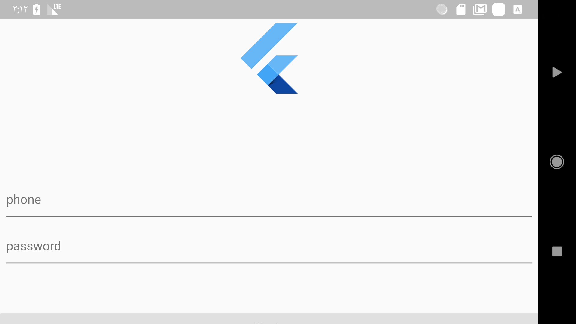
Now let me show you a simple example where this comes handy. let’s say you have a login page that looks like this :
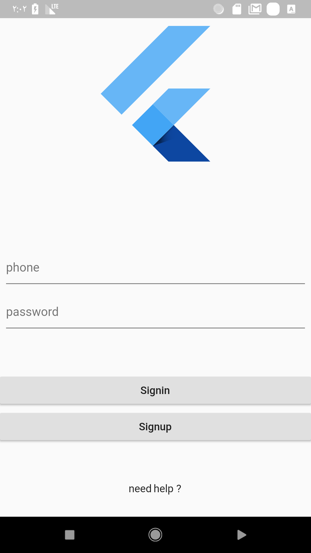
Now if you change it to landscape it will look like this :
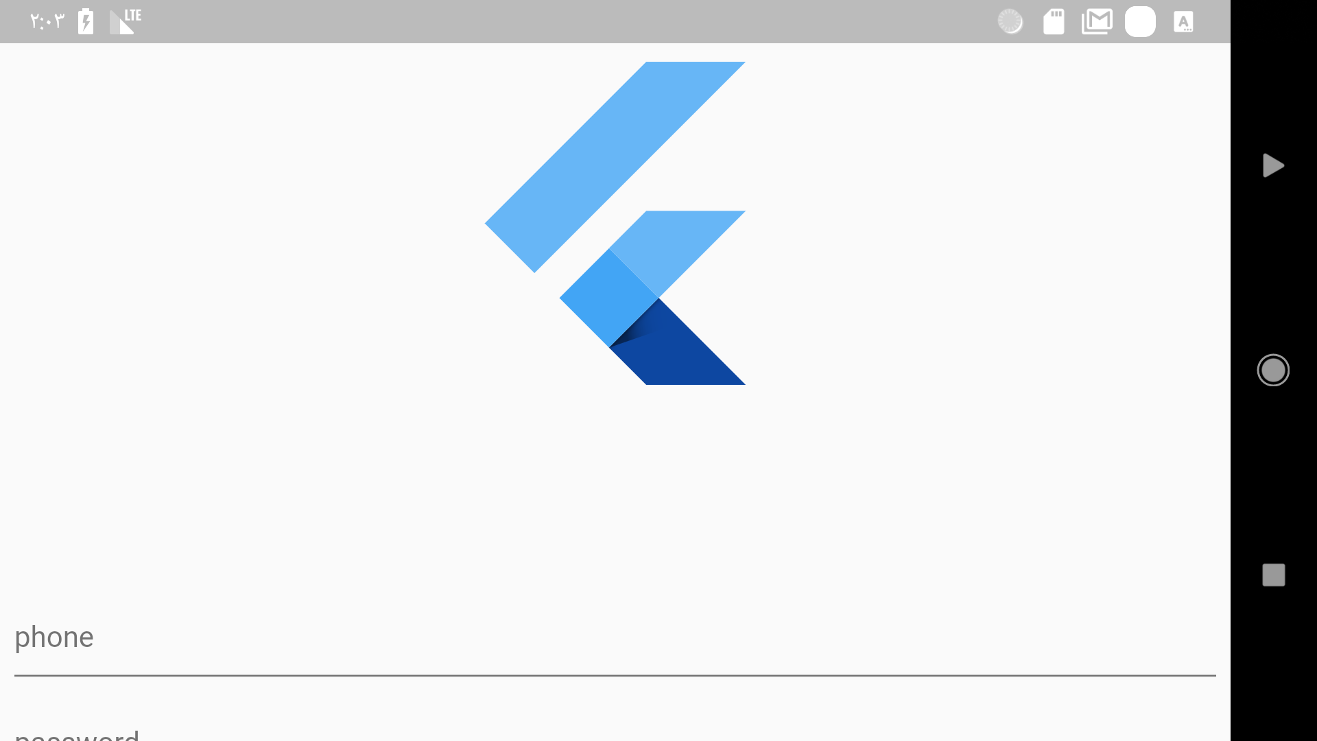
This is not something you should show to the user, in the login page the user expects to see the input field to write the login information. Let’s fix this using the OrientationBuilder.
The fix is simple if the orientation is portrait then the size is 200.0 otherwise it’s 100.0 so now it will look a little bit better.
Okay that’s it for orientation but if you want to see how to deal with orientation in a crazy way take a look at this implementation by Simon Lightfoot :
Should I care about Desktop support?
如您所知,Google 正在開發一個名為 fuchsia 的新 OS,該操作系統也將適用於 desktop 和 mobile,而 flutter 將成為其官方開發工具。
As of 2019 Desktop is now a primary goal for the flutter team
因此,您現在為 Android, iOS 創建的 apps 也可以在 fuchsia 上運行。問題是:我應該關心 (響應式 UI) 在 desktop 的支援度嗎?目前而言我的回答是 “No”,因為在 fuchsia 中,該 app 可以在 desktop 和 mobile 兩種模式下工作,即使您在 desktop 模式下執行該應用程式,如果您遵循上述建議,也會看起來不錯。
Conclusion
That’s it for me I hope you enjoyed this article if you did feel free to clap and share with others if you didn’t please let me know in the comment’s what I am missing. And for the final advice I would say :
in responsive design don’t think about specific device because you will just get in trouble
all the examples shown in this article can be found on this repo
Follow me and the flutter community on twitter for more articles.